
Your cart is currently empty!
Introduction:
The right colors can make a room feel warmer, calmer, richer, or more inviting without changing everything in it. Even a simple room can look thoughtfully designed when its colors work well together.
In this guide, I’m sharing 10 elegant home color ideas that you can use in different parts of your home. From cozy living rooms to stylish kitchens and peaceful reading corners, you’ll find color combinations that are beautiful, practical, and easy to recreate.
Why Does Color Matter in Home Design?
Color affects how a room looks and feels. Light colors can make a small space feel more open, while deeper shades can add warmth, depth, and character.
But choosing colors is not just about picking your favorite shade. It is also about how different colors work together.
Here are a few simple things I keep in mind when choosing a home color palette:
- Start with one main color. Choose the shade you want people to notice first.
- Add two or three supporting colors. These help the room feel balanced instead of overwhelming.
- Mix different textures. Wood, marble, velvet, linen, and glossy finishes can make a simple palette more interesting.
- Pay attention to lighting. The same paint color can look different in natural daylight and warm evening light.
- Repeat colors throughout the room. Using the same shade in cushions, curtains, or accessories helps everything feel connected.
1. Olive Green and Warm Ivory Living Room
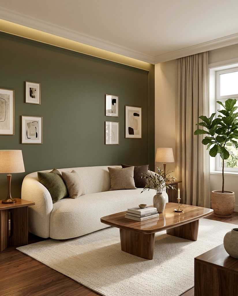
Olive green is a beautiful choice if you want your living room to feel cozy, elegant, and connected to nature. It has more depth than a basic neutral color but still feels calm and easy to live with.
Why this color combination works
Olive green adds character, while warm ivory keeps the room from feeling too dark. Walnut wood brings another layer of warmth and makes the combination feel classic rather than trendy.
How to use these colors
- Paint one main wall muted olive green if you want a subtle change.
- Choose an ivory or cream sofa to keep the room bright.
- Add walnut furniture, such as a coffee table or TV console.
- Use beige curtains and cushions in olive, cream, and soft brown.
- Finish with warm table lamps, plants, and a few brass accessories.
I would keep the larger furniture pieces neutral and use olive green on the walls or smaller decor items. This makes the look easier to update later.
Best for: Cozy living rooms, classic interiors, and homes that need a little more color without looking too bold.
2. Glossy Taupe and Walnut Kitchen
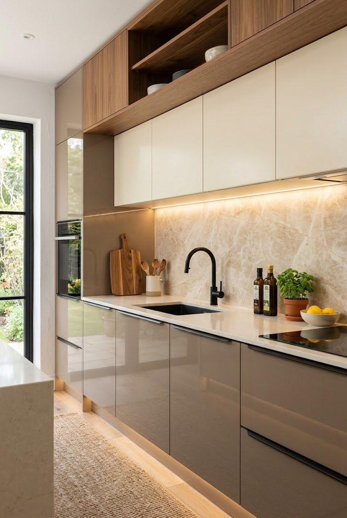
If you love a modern kitchen but don’t want it to feel cold, taupe and walnut are worth considering. This combination looks polished and warm without relying on bright colors.
Why this color combination works
Taupe sits between beige and grey, so it feels neutral but more interesting than plain white. Walnut adds natural warmth, while cream marble creates a clean, refined finish.
How to use these colors
- Choose warm taupe cabinets for a soft, modern look.
- Combine them with walnut cabinets or open shelving.
- Use a cream marble-look backsplash with subtle veining.
- Add a black faucet and simple cabinet handles for contrast.
- Install warm under-cabinet lighting to highlight the backsplash.
Glossy cabinet fronts can reflect light and make the kitchen feel brighter, especially in smaller spaces. However, a full high-gloss finish can show fingerprints easily, so consider using gloss on selected cabinets and a softer finish elsewhere.
Best for: Modern kitchens, compact cooking spaces, and anyone who wants a clean but welcoming kitchen.
3. Dusty Blue and Walnut Bedroom
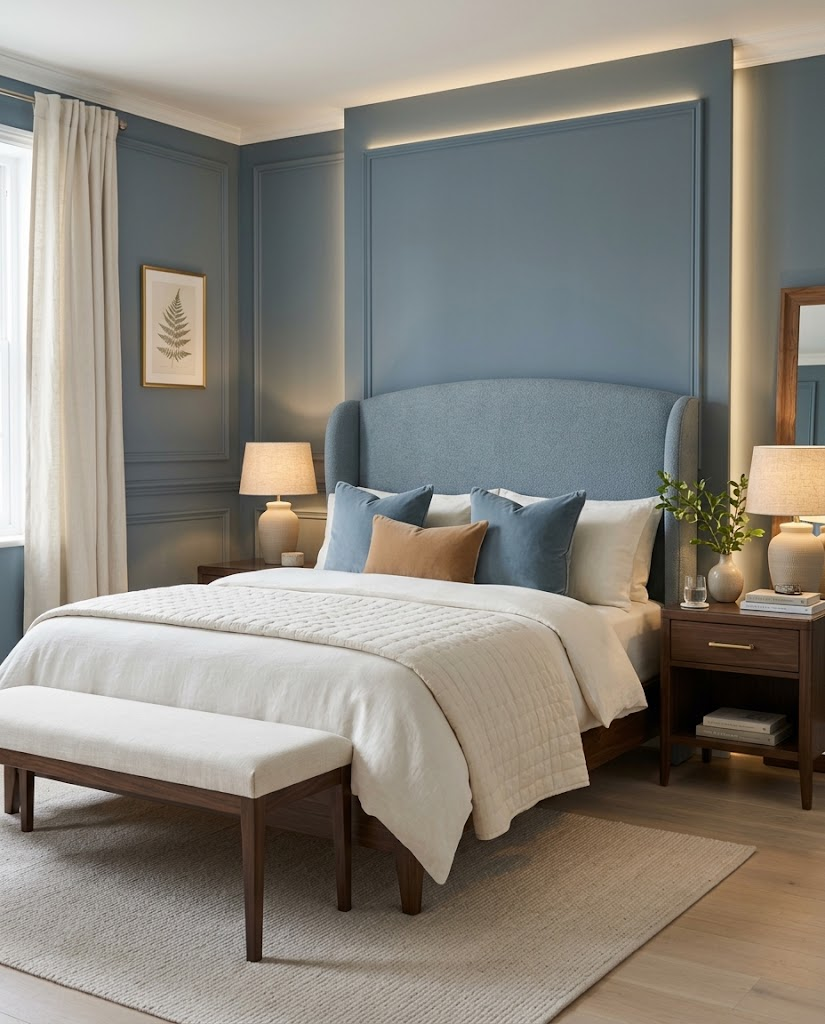
Your bedroom should feel restful, and dusty blue is a lovely color for creating that atmosphere. It has enough color to make the room interesting without being too bright or distracting.
Why this color combination works
Dusty blue feels soft and understated. Ivory adds brightness, while dark walnut furniture gives the room depth and prevents the palette from looking too pale.
How to use these colors
- Use dusty blue on the headboard wall or through upholstered furniture.
- Layer ivory bedding with a few blue and caramel cushions.
- Add walnut bedside tables for a rich contrast.
- Choose warm bedside lamps instead of relying only on ceiling lights.
- Finish with soft curtains, a neutral rug, and simple wall art.
I would avoid using too many different shades of blue in one room. One main blue, a few warm neutrals, and natural wood are usually enough to create a balanced look.
Best for: Peaceful bedrooms, guest rooms, and anyone who prefers a soft, classic color palette.
4. Chocolate Brown and Cream Reading Nook
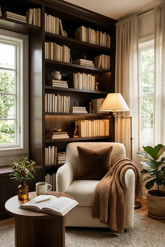
A reading corner doesn’t need much space to feel special. Sometimes, a comfortable chair, a small table, and the right colors can turn an unused corner into a cozy place to relax.
Why this color combination works
Chocolate brown creates a warm, enclosed feeling, while cream keeps the space from looking heavy. Caramel adds a softer transition between the two colors.
How to use these colors
- Use dark brown shelving or a small brown accent wall.
- Place a cream armchair with a soft, textured cushion.
- Add a walnut side table for books and a cup of tea.
- Use a warm floor lamp positioned beside the chair.
- Add a throw blanket, a small plant, and a few neatly arranged books.
If the corner is small or has limited natural light, use brown mainly on the shelves and furniture rather than covering every wall in a dark shade. Good lighting will help the details stand out.
Best for: Reading corners, home libraries, and cozy spaces beside a window.
5. Burgundy and Dusty Rose Powder Room
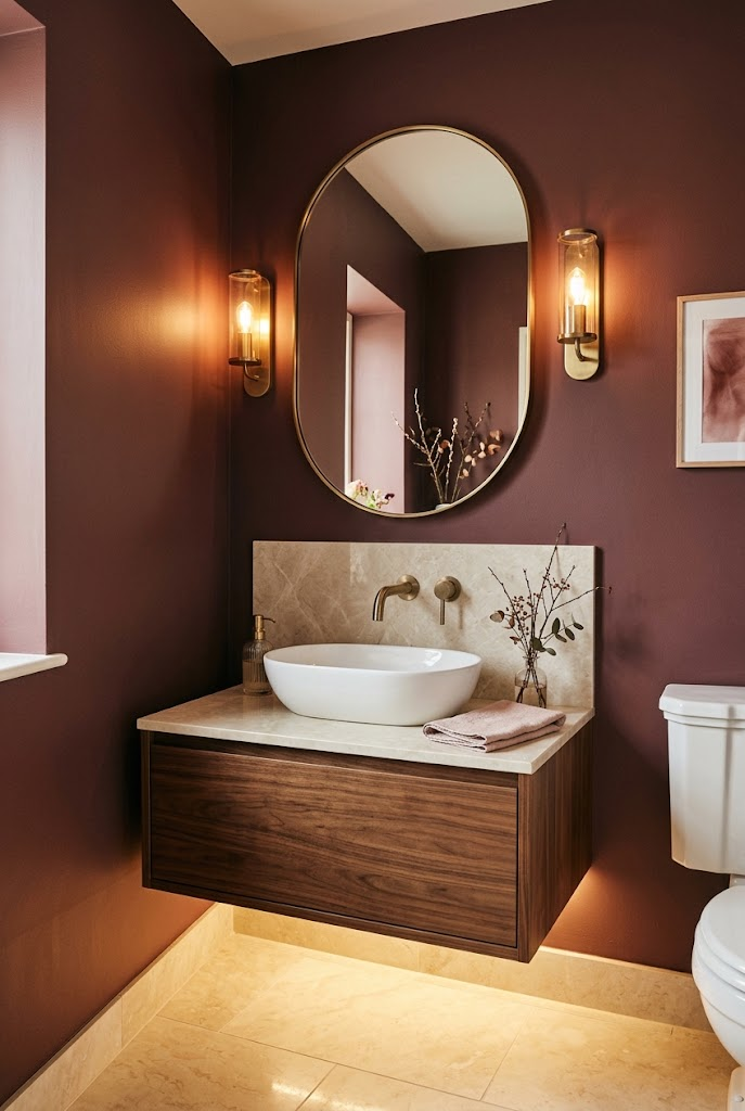
Burgundy may not be the first color you consider for a small bathroom, but it can look incredibly elegant when balanced with lighter shades.
Why this color combination works
Burgundy brings depth and richness, while dusty rose softens its intensity. Cream marble and brass details add brightness and a classic finish.
How to use these colors
- Paint one wall in muted burgundy rather than using the color everywhere.
- Choose a walnut vanity with a cream countertop.
- Add a rounded mirror with a brass frame.
- Use warm wall sconces to make the colors feel softer.
- Introduce dusty rose through towels or small accessories.
For a small powder room, lighting is especially important. A dark color can look beautiful, but poor lighting can make the space feel cramped. Keep the mirror well lit and include a lighter surface to balance the deeper shade.
Best for: Small powder rooms, elegant guest bathrooms, and interiors that need a richer accent color.
6. Sage Green and Cream Breakfast Corner
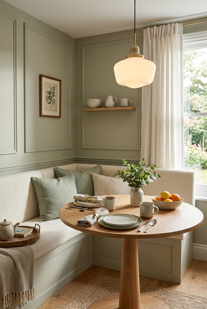
A breakfast nook should feel comfortable enough for slow mornings but stylish enough to become a favorite part of the home. Sage green is perfect for this because it feels gentle, natural, and easy to combine with neutrals.
Why this color combination works
Sage green adds a hint of color without demanding too much attention. Cream makes the seating feel soft and bright, while oak wood adds a natural, welcoming finish.
How to use these colors
- Paint the wall sage green or add simple wall paneling.
- Choose a cream upholstered bench with sage cushions.
- Add a round oak table to make movement easier in a compact corner.
- Hang a warm pendant light above the table.
- Decorate with a ceramic vase, fresh greenery, and neutral table linens.
A round table works particularly well in smaller breakfast corners because it has no sharp corners to work around. Keep the decor simple so the area remains practical for everyday meals.
Best for: Small dining corners, kitchen breakfast nooks, and bright, relaxed interiors.
7. Midnight Navy and Antique Brass Home Office
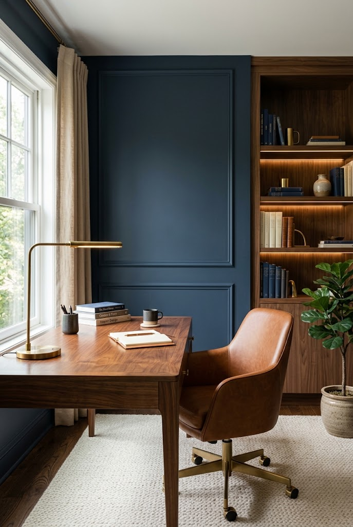
If you want your home office to feel focused and sophisticated, midnight navy is a strong choice. It adds character without relying on bright or distracting colors.
Why this color combination works
Deep navy gives the room a grounded, classic appearance. Walnut makes it warmer, cognac leather adds contrast, and antique brass introduces a subtle glow.
How to use these colors
- Use navy on one wall or on built-in shelving.
- Choose a walnut desk with a comfortable cognac-colored chair.
- Add a brass desk lamp for focused lighting.
- Keep books and accessories in neutral shades.
- Use a cream rug and warm curtains to soften the darker colors.
I would avoid making every surface dark, particularly if your office is small. A navy feature wall can create the desired effect while lighter flooring, curtains, and natural light keep the workspace comfortable.
Best for: Home offices, study rooms, and reading spaces with a classic, tailored look.
8. Terracotta and Cream Entryway
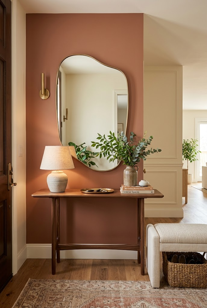
Your entryway is the first part of your home people see, but it is often left plain. Terracotta is a great way to give this area warmth and personality without needing lots of decoration.
Why this color combination works
Terracotta has an earthy warmth that pairs beautifully with cream and natural wood. Together, these colors create a welcoming look that feels timeless rather than overly formal.
How to use these colors
- Paint the console wall a muted clay or terracotta shade.
- Add a slim walnut console table.
- Hang a large mirror to reflect light and make the area feel more open.
- Use a cream upholstered bench if space allows.
- Finish with a warm lamp, a ceramic vase, and a neutral runner.
If you don’t want to repaint, you can introduce terracotta through a runner, decorative vase, or framed artwork instead. The goal is to create a clear color accent without filling the entryway with unnecessary items.
Best for: Small entryways, hallways, and homes that need a warmer first impression.
9. Forest Green and Cream Bathroom
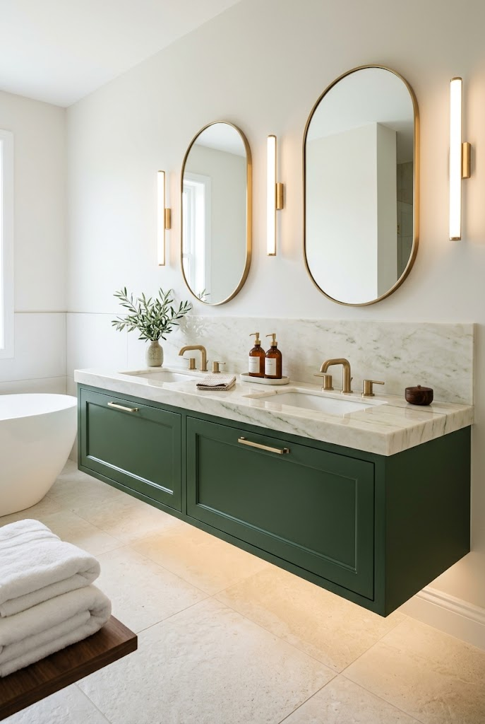
Forest green can make a bathroom feel polished and relaxing, especially when paired with cream stone and warm metallic details. It is a richer alternative to the usual all-white bathroom.
Why this color combination works
Forest green provides depth, while cream marble keeps the overall design bright. Brass adds warmth, and white towels introduce a clean, fresh contrast.
How to use these colors
- Choose forest-green vanity cabinets as the main color feature.
- Pair them with a cream countertop and a light stone backsplash.
- Add brass cabinet handles and matching mirror frames.
- Use warm lighting around the mirror.
- Finish with fluffy white towels, simple dispensers, and a little greenery.
You don’t need to change the entire bathroom to get this look. Repainting the vanity, updating the handles, and changing a few accessories can create a noticeable difference without a full renovation.
Best for: Modern classic bathrooms, guest bathrooms, and anyone who wants a spa-inspired space with more character.
10. Muted Plum and Champagne Bedroom Corner
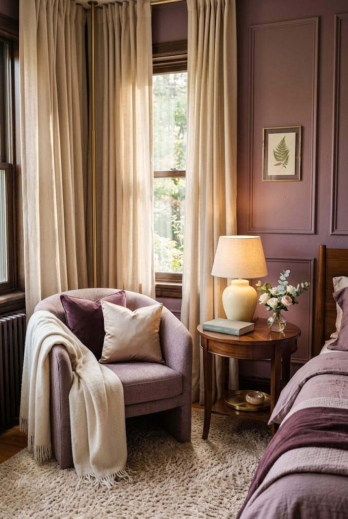
If you prefer softer, more romantic colors, muted plum and champagne make a beautiful combination. This palette feels elegant and cozy without becoming overly pink or decorative.
Why this color combination works
Muted plum adds depth, while dusty mauve creates a gentle transition. Champagne beige keeps the palette light, and walnut adds a grounding natural element.
How to use these colors
- Use muted plum on a small feature wall or through an accent chair.
- Add a dusty-mauve cushion or upholstered seat.
- Choose champagne curtains and a cream rug.
- Place a walnut side table beside the chair.
- Finish with a warm lamp, a soft throw, and a simple vase.
The secret is to let the deeper plum shade stand out without using it everywhere. Keep the larger surfaces lighter, and use mauve and plum in carefully chosen places.
Best for: Bedroom corners, dressing areas, cozy seating spots, and soft, elegant interiors.
Simple Tips for Choosing the Right Colors for Your Home
You don’t need to follow every trend to create a beautiful home. What matters most is choosing colors that work with your existing furniture, lighting, and the way you use each room.
Here are a few practical tips to help you get started.
Start with what you already own
Look at your floors, sofa, kitchen cabinets, and larger furniture pieces before choosing a wall color. These items are often more expensive to replace, so it makes sense to build your palette around them.
Test paint colors before committing
Paint a small sample on the wall and observe it in daylight and in the evening. A color that looks soft in the morning may appear much darker under warm artificial lighting.
Don’t mix too many competing shades
Choose one main color and a few supporting neutrals. You can always add a small accent through cushions, artwork, flowers, or decorative objects.
Use lighting to bring out the colors
Warm lamps can make earthy shades, creams, and wood tones feel cozy. Under-cabinet LEDs can highlight kitchen finishes, while bedside lamps help bedrooms feel more relaxing.
Remember that finishes matter too
The same color can look different on matte paint, glossy cabinets, velvet upholstery, or polished wood. Mix finishes thoughtfully instead of making every surface shiny.
Final Thoughts
A beautiful home doesn’t always require new furniture or a complete makeover. Sometimes, the biggest change comes from choosing colors that work together.
Olive green can make a living room feel richer, dusty blue can soften a bedroom, and forest green can give a simple bathroom a more refined look. Each palette creates a different mood, even when the furniture and layout remain simple.
If you’re planning to refresh your home, start with one room and one color combination. Test a few shades, pay attention to the lighting, and make small changes before committing to a bigger project.
Which color combination would you try first? Save your favorite ideas and use them as inspiration for your next home refresh.
Categories: Home Decor
Leave a Reply